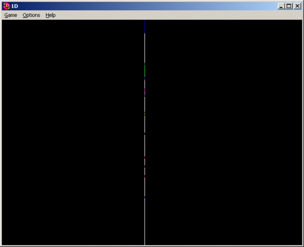
I like this one, it's a nice interpretation of the theme, and your levels are well designed, but this is too hard for my eyes, especially on my bright screen. Since we're playing in one dimension have you considered allowing us to play with a 100%-width sprite? (I don't know if it would look). I sure like the intro as well, when you shrink then expand the line. Less is more.
Whoa! After playing this game, I totally have the ghosted effect on my vision for staring so intently at that white line!
Loved the design challenge, but would have preferred it to be easier to get through. Sounds could also have kept it to the idea while helping communicate more of what's happening for the player.
Comments9
I sure like the intro as well, when you shrink then expand the line. Less is more.
It reminds me a bit of linescape http://azurenimbus.com/
Loved the design challenge, but would have preferred it to be easier to get through. Sounds could also have kept it to the idea while helping communicate more of what's happening for the player.