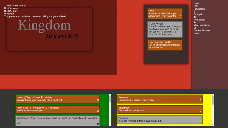
Unfinished? It's already got some pretty solid mechanics functioning. I'm not a huge text-game guy myself, but it looks pretty well laid out. Having the different colored areas for missions/buildings/people makes it pretty easy to identify what the sections are for, but a heading for each would be really helpful.
A nice take on the clicker game genre I think, the missions were fun. Though the fact I had to keep scrolling constantly to see everything was rather annoying, and the messages pushing the entire game down whenever you do something was slightly annoying too. Putting a scrollbar on the message log would be immensely helpful I think.
Falls prey to the same issue as a lot of the mobile real-time management games: namely, that as I have to wait for resources to build up, I tend to want to leave. Computer RTS games tend to have minute-by-minute management, which alleviates this issue. Cool concept, I just think the controls need some work to be compelling.
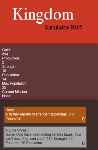
Ok, I am not going to rate the game right away, as I fell that with a bit of UI design you can give the user a much much better experience. 1st) This stats;
Gold: 656
Production: 2
Strength: 10
Population: 14
Max Population: 25
Current Mission:
Should not be vertically separated. Do tab separation: Gold: Production: Strength: Population: 656 2 10 14/25
Current Mission:
See how everything fits nicely in just 2 lines? Also, I merged population with max population by using a /.
2nd) Make this same stats always be the top of your UI. (equivalent to: position: fixed; in CSS.
Once you've managed to fix these two issues, feel free to leave me a message on my comments section and I will be happy to return and rate your game =)
Is it normal than after a while I am only able to build house (100 of them), and nothing more than the academy, but no archery and my stables+barracks+blacksmith does not allow me to have cavlry but I have knight?



Comments10
Story telling via the missions was pretty neat.
Putting a scrollbar on the message log would be immensely helpful I think.
1st) This stats;
Gold:
656
Production:
2
Strength:
10
Population:
14
Max Population:
25
Current Mission:
Should not be vertically separated. Do tab separation:
Gold: Production: Strength: Population:
656 2 10 14/25
Current Mission:
See how everything fits nicely in just 2 lines? Also, I merged population with max population by using a /.
2nd) Make this same stats always be the top of your UI. (equivalent to: position: fixed; in CSS.
Once you've managed to fix these two issues, feel free to leave me a message on my comments section and I will be happy to return and rate your game =)