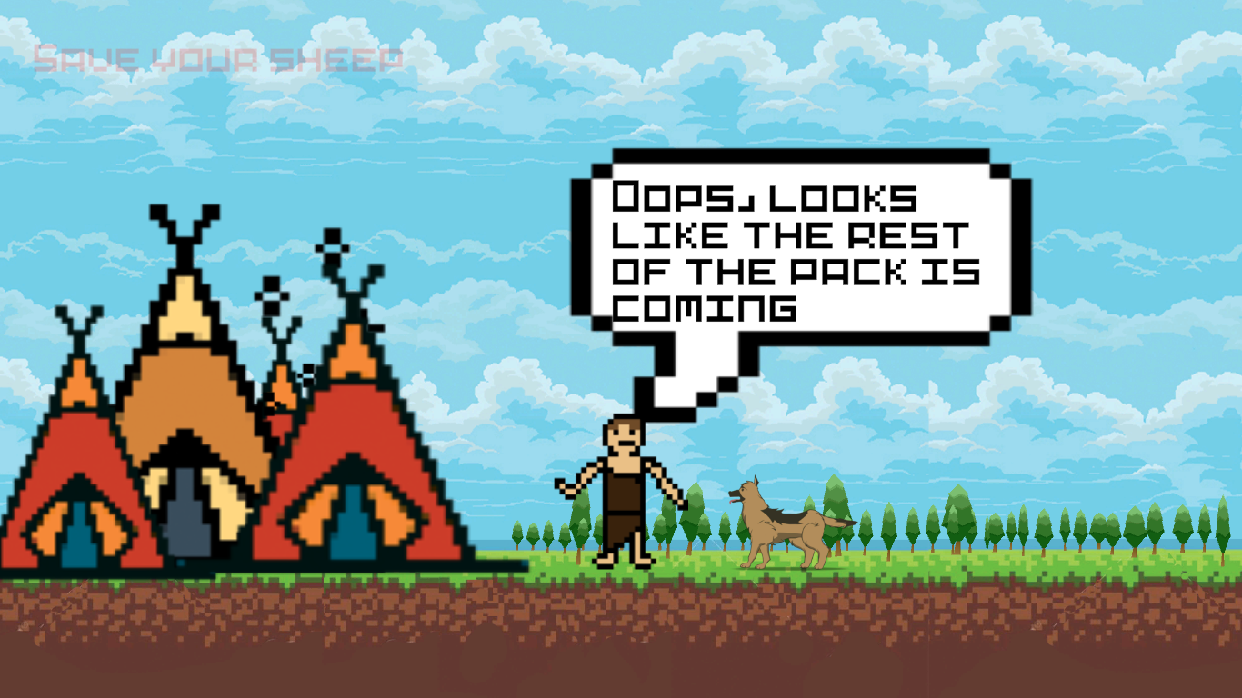
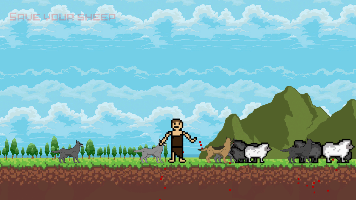
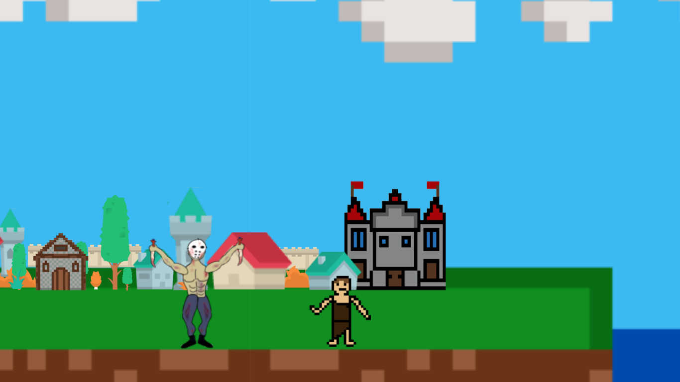
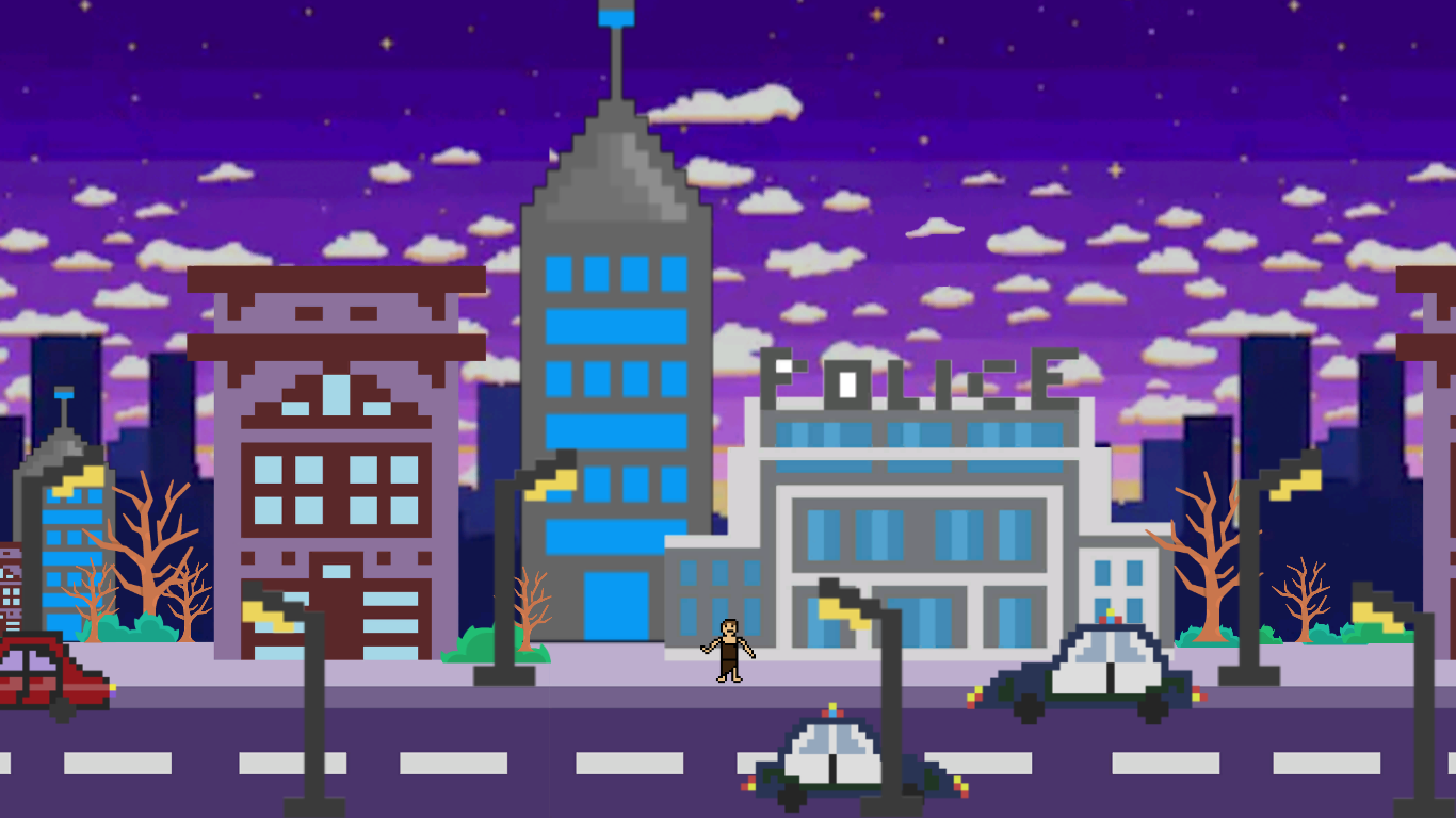
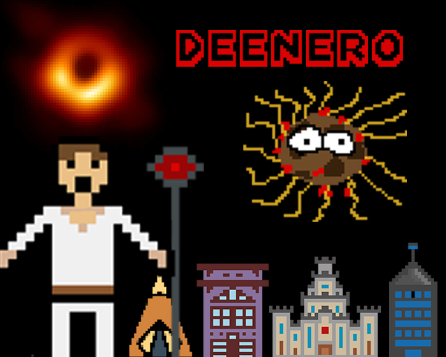
Deenero is a game where the protagonist gets a special gift from the flying spaghetti monster which is being able to remember the previous lives and have an infinite amount of lives. Throughout his journey, he is challenged in different ways and in all of his lives he tries to find a purpose and fulfill it. The game portrays different periods of time and a few challenges that the character goes through.
Team: Luis Perez (Art) Fjolla Dedaj (Art) Hamza Syed (Level design, art) Andrea Zablah (Art) Ulises Olmedo (Art) Carlos Salazar (Programming) Kelan Garcia (Programming, art)
I was kinda confused the whole time, like sockyman said it was hard to read the text. Next time I would chose a more readable font. Definitely a unique take on the theme, I liked it.
Didn't really get want to do at first but eventually got it. I think that the text resizing was a bit distracting, perhaps just settling with a smaller font would have been better. Also I think having some music and sounds would have really improved the mood of the game.
Great game! Loved the spaghetti monster. Only issue i had was the lack of sound and the text resizing as the others mentioned but other than that I actually really enjoyed it, and thought it was really funny. thank you :)
This seems like a cool concept, but some technical issues make it difficult to appreciate, the most significant of which is that the text shrinks as it appears, which makes it very hard to read.
Played through it. Congratulations completing the jam and working as a team. Story was odd, but kept my attention. I agree with the other comments in regards to the text.. as it resizes you quickly lose your place you were reading, making it difficult on the eyes/brain - so in future text presentation, you may want to keep it a single size and not have it move as much.
Congrats on finishing a game! Um... I don't know how to interpret it? It has one of the weirder stories and a strange sense of morals, but okay. It's definitely a start into game making!
The text resizing as it was printing out was annoying to read. Usually a good tactic is to just pick a static font size, fill the text space, measure it and make a window that wraps around the size (in the background before the first frame loads).
I kinda liked the scattershot, incoherent, clashing art style to it. It gave a weird, tongue-in-cheek aesthetic to the whole thing.
There's a lot about the interface that could be improved on. The changing text size, as people have mentioned. Also, the font itself isn't very readable. Functionality you take place over style. Then there's the controls, having a right-click function when there is no left-click funciton is odd, and having to press space to advance text when my hand is already on the mouse... why no just click to advance text. I do like the concept and story, and I definitely lol'ed at "yeaa boiii"


Comments12
Note: When I went up the building I never jumped down, but it said that I committed suicide. I don't know if that was meant or it was a bug.
Good Luck :thumbsup:
The text resizing as it was printing out was annoying to read. Usually a good tactic is to just pick a static font size, fill the text space, measure it and make a window that wraps around the size (in the background before the first frame loads).
I kinda liked the scattershot, incoherent, clashing art style to it. It gave a weird, tongue-in-cheek aesthetic to the whole thing.
The changing text size, as people have mentioned. Also, the font itself isn't very readable. Functionality you take place over style.
Then there's the controls, having a right-click function when there is no left-click funciton is odd, and having to press space to advance text when my hand is already on the mouse... why no just click to advance text.
I do like the concept and story, and I definitely lol'ed at "yeaa boiii"